In this section of my tour of my websites, I will look at Bootstrap. I have used Bootstrap to create Picture Postcards Online, a small project website website. The pages of this Guided Tour have also been created with Bootstrap.

Bootstrap is an open-source front-end responsive web development framework.
I built the original version of Picture Postcards Online in 2005, as a project while on a web development module at the University Of Paisley. It was hand-coded with XHTML, and featured a prototype guestbook and search engine built with PHP and MySQL. I went on to develop these features in my other websites.
I have now decided to update Picture Postcards Online, and re-build it with the Bootstrap framework.
The main features of Bootstrap are:
Bootstrap uses a responsive grid system for web page layout. The grid can have up to twelve columns on large screen sizes.
The responsive grid automatically adjusts, depending on the screen size of the device on which the page is being viewed. On Picture Postcards Online, I used a responsive grid for the footer area of each page. The following two screenshots show how the grid adjusts with screen size:
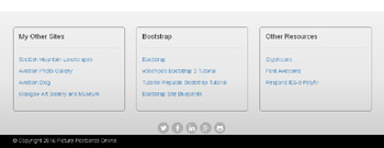
This is the 3-column grid of the footer area, viewed on a wide-screen device such as a desktop. The three columns are side by side.
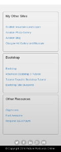
This is the same 3-column grid, viewed on a narrow-screen device such as a mobile. The three columns have automatically re-arranged, and are now stacked on top of each other.
When the columns are stacked in this way on a mobile device, the user can easily scroll up and down, making the information easier to read. Horizontal scrolling is not required.
The responsive navbar uses the collapse Bootstrap javascript plugin to automatically adjust, depending on the screen size of the device on which the page is being viewed.
Bootstrap includes various types of responsive navbar:
On Picture Postcards Online, I used a static top navbar on each page. The following two screenshots show how the navbar adjusts with screen size:
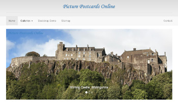
On a wide-screen device, the navbar at the top of each page is the full width page of the page, with the links arranged horizontally.
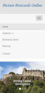
On a narrow-screen device, the navbar has automatically collapsed. All that remains is a small grey rectangle with three horizontal lines: this is the navbar symbol.
Clicking on the navbar symbol opens up the navbar. The links are now stacked vertically, which is ideal for mobile devices. No horizontal scrolling is required to view the navbar links.
On Picture Postcards Online, I have included a demonstration of some of the other features of Bootstrap. It includes Dynamic Tabs, Accordion, Collapsible Panel, Collapsible List Group, Panels with Contextual Classes, Popovers, Tooltips, Modal, Google Map and Embedded YouTube Video.